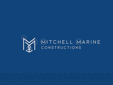
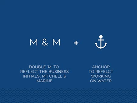
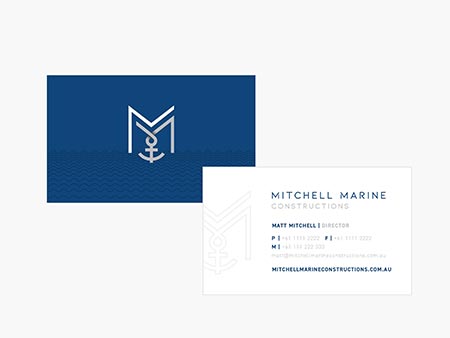
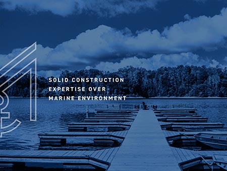
What we created: After extensive research and development we created a monogram that incorporated a double ‘M’ which referenced the Mitchell & Marine in the business name. We wanted to take it that one step further and bring in an anchor symbol to seamlessly work together to reflect the marine element of the business which has also been purposefully positioned to fall below the legs of the ‘M’ to show the anchor being below the water line. We then combined this monogram design with a customised wordmark to create a modern and unique logo for their brand. The
Logo: First ‘m’ reflecting the word mitchell from the business name. The second ‘m’ reflecting the word marine from the business name. An anchor symbol to represent the marine element of the business and working on water. Anchor has been designed to fall below the legs of the ‘m’ to reflect the anchor being below the water line. The business name has been customised tie in the ‘m’ from icon & to create a unique wordmark logo.


.jpg)
.jpg)
.jpg)